Customer Support At Google

Problem
How might we streamline errors and reduce user pain so that we can improve customer satisfaction?
Approach
I created a simple workflow with a visual representation of the case relationships, which expanded the use of existing Material design system components
Impact
I received a thank you video from the support agents as a result of my redesign of a “Mark as Duplicate” flow — an annoying and repetitive task.
Design Approach
As a contract interaction designer, I designed, validated and supported implementation of new product features for customer support software.
I worked on two key projects:
Mark as Duplicate workflow
This optimization of an existing workflow was intended to reduce errors, thus resulting in better service to end users.Future redesigns of card components
This project envisioning new and redesigned component within the future design direction of the product.
Client
Google
Duration
7 month contract (Jan.-Aug. 2016)
My Role
Lead Product Designer
Collaborators
1 Product Manager, 3-5 Front-End Engineers, 2 Interaction Designers, and 3-5 Back-end Engineers
Note: Because of the proprietary nature of this product, details below will be limited.
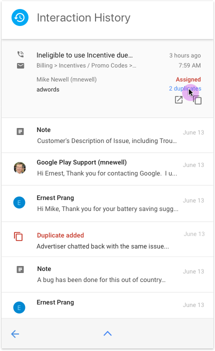
Mark As Duplicate Workflow: Reducing Errors and User Pain


Why was this important?
Google needs good data on what were new support cases or new touchpoints on an existing issue. These support center metrics would have implications agent training and COGS.
I led design on the project from discovery interviews to final implementation and rollout. To develop a UX strategy and approach, I shadowed agents during live customer interactions to identify specific user issues. I then partnered with product managers and engineers to identify a short list of concepts. I was also responsible the concept in final visual design mocks that utilized and extended Google’s Material design system. During implementation, I advised on edge cases, visualize missing requirements and make adjustments in response to technical limitations.
Agents need up-to-date info on the case and customer sentiment. Duplicate contacts may collect new information, so easy access makes this info less likely to be lost. If a single case has 20 duplicates, there’s likely a frustrated client on the other end of the phone/chat.
Customers want better and quick resolutions. It’s frustrating when companies can’t keep track of all the conversations around the issue, even if other agents have been involved.
Challenge: Extending Material Design
The horizontal swap icon was unique in our product, though it already existed in the official icon library. So, I executed multiple rounds of medium-fidelity and high-fidelity usability tests with support agents to test comprehension.
I also had to decide to label or not label. Google tends to avoid labels, but it was still supported by the style guide. I chose to label so that agents would not miss the subtle switch of information.
I brainstormed multiple terms, but “swap” was the shortest and most explicit to what we were doing — swapping the parent and child issues.
Updates Throughout the Product
This workflow impacted data throughout the card-based product. I updated card visual design to reflect status, while also adding interactions for accessing duplicates.


Future Redesigns of Card Components: Envisioning the Next Generation of the Product
I was also involved in executing foundational design work for the next generation of the product.
Taking direction from the design lead, I explored the jobs-to-be-done by each card and created journey maps documenting how existing cards were utilized through the ticket resolution process.
I collaborated with teammates to add more fidelity to the interaction patterns, including very low-fidelity prototyping. While I did not see these efforts implemented, I did document them for the team’s future releases.

